

Tuesday, December 13, 2011

Tuesday, December 6, 2011

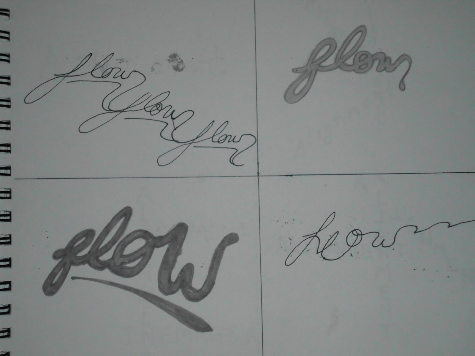
Rough Graphic Thumbnail in Black

*The background image will be faded so the text could be seen. The text will also be changed.


Thursday, December 1, 2011


Tuesday, November 29, 2011
History of Tango Dancing
What is tango dancing?: It is a dance of latin american origin in duple time (2/4 time), often characterized for it's gliding strides, sudden pauses and provocative poses. The music called tango was composed specifically for this dance.
Where did Tango start?: In Argentina among the lower class and in the brothels, where the entertainment of the lower class was.
When did it start?: The time in which the dance originated in relatively unknown. Many guess that it began at the end of the eighteenth century, but there is no written proof. The eight of the popularity of Tango hit a big boom around the turn of the twentieth century. Then in present times, tango has been brought back into a renaissance and many dancers are dancing that style today.
Who danced the tango?: Originally the poverty stricken people of Argentina danced the tango for entertainment. As time went by, the dance style left the brothels and made it into the dance halls where the middle class and higher class people would dance a less provocative form of the dance called "ballroom dancing."
How was the Tango performed?: In earlier times in Argentina, the tango was performed in brothels and then it made it's way to the dance halls. However, there were also street organs in the streets of argentina that had played tango music and people would dance tango on the sidewalks and streets. This is still seen as a norm in Argentinian culture today. It is also not uncommon to see male partners dancing tango for practice.
History Design Styles

-The design on the left is an art deco design. Some attributes that make this design art deco are:
*The composition of this design is very angular and cutting edge.
*The typography is typical of art deco and arranged in way to suit the design.
*The blending and shading of the subject is more abstracted.
-The design in the middle would be classified as a constructivist. Here is why:
*The color choice is bright and eye catching.
*It appears that the designer had cut out images from a newspaper of magazine to create a feeling of a collage.
*The typography is apart of the design itself and in a blocky style.
-The design on the right is art nouveau and here's why:
*The design is very elegant and flowing.
*The designer had used a floral pattern to frame the main subject of the design.
*The typography appears to be in a hand-rendered style, yet very elegant.
Thursday, November 10, 2011


Thursday, November 3, 2011


Tuesday, November 1, 2011

Thursday, October 27, 2011
Charlie Chaplin Illustration Remastered

I had edited the painting through photoshop, mainly to clear away any imperfections from when I had taken the picture.

Tuesday, October 25, 2011
Step # 4 Illustration Image

Charlie Chaplin, Oil on Canvas, 11x14, by Adriana Townsend
My stamp design for this project is to commemorate silent movies. Since Charlie Chaplin is most often thought of when one thinks of silent movies, I chose to paint an image of him so I could use an original image of him for my design. So since Charlie Chaplin is the top silent movie icon, it's only fitting that he is commemorated in the stamp.
Tuesday, October 18, 2011
Some Favorite Stamps

* The stamp in the right hand corner for it's a simple picture. If it had a design, it would probably be considered art nouveau considering the time the picture was taken.
*The last stamp on the bottom center is my favorite of them all because it's design would be considered art deco and it's actually kind of humourous when you consider the title of it, "The Girl He Left Behind."
Historical Stamp Design Styles
 |
| Add caption |
*The stamp to the right of the montecarlo stamp is also very much art nouveau for the same reasons as the other stamp.
*The lower left stamp would be considered art deco for the abstracted yet still elegant form. The font also gives the historic design type away.
*The small collection of stamps in the bottom right corner would also be considered art deco mainly because there are elegant organic curves that interact with the subject of the design. There are bright colors incorporated with the design.

Tuesday, October 4, 2011
Project 1 Evaluation Essay
In my opinion, my project addresses all of the criteria needed for he project to be successful. To start, the negative space, unlike the first final draft, has increased, but leaves a comfortable amount of space between each word so that the design does not get overly busy. There is also an obvious hierarchy in the design that was mentioned in the criteria. Emphasis, for example catches the eyes instantly with it's bold, dark letters and it then leads the eye to Balance and Contrast. From contrast you notice the repeated word flow and with it's curves it makes you notice repetition and alignment. The different values of the design also contribute to where your eye goes first. A good example would be that emphasis is the darkest, balance is the second darkest, and the third darkest is the "rast" in contrast. Another way in which value was used is that the word repetition fades away in value with each row of the repeated word, giving the design with a sense of depth, as if it is going into space. Also, if the value didn't change, the weight of the word would be too heavy and would have dominated over balance and contrast.
On the other hand, the design also conforms to the rule of thirds with the focal point on the upper left intersection and off center. This diagonal focal points forms the direction in which the eye follows throughout most of the piece. The only words that does not copy that direction would be repetition and alignment, but repetition was only done to add tension between the words and to play with the negative space. Alignment, however was in the corner, framing the design and repeating the framing that contrast had done in the lower right hand corner. In contrast, the word flow follows along emphasis, but swirls near the end of the line, activating negative space. Therefore, due to the consideration of value, negative space, word design, and the use of rule of thirds, this design is successful.

Thursday, September 29, 2011

Tuesday, September 20, 2011


Wednesday, September 14, 2011


Tuesday, September 6, 2011


Subscribe to:
Posts (Atom)